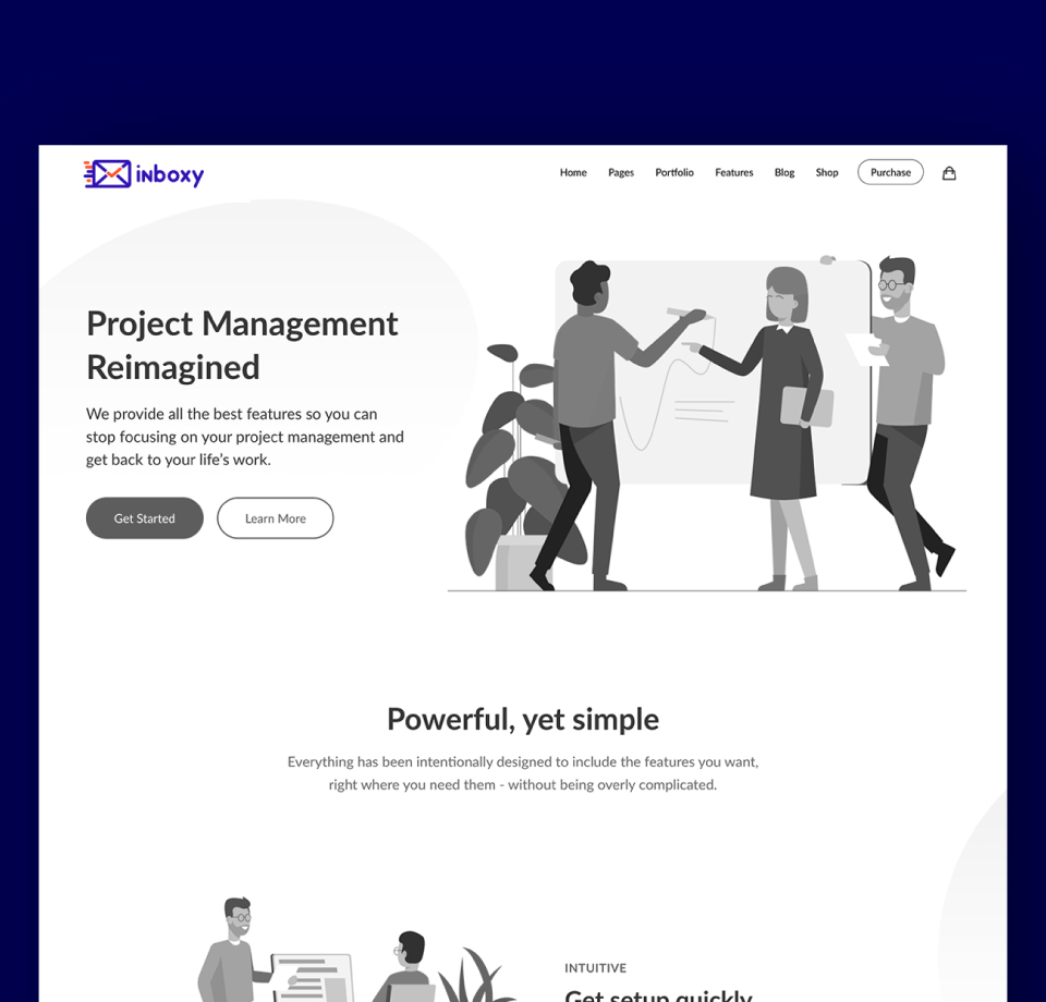
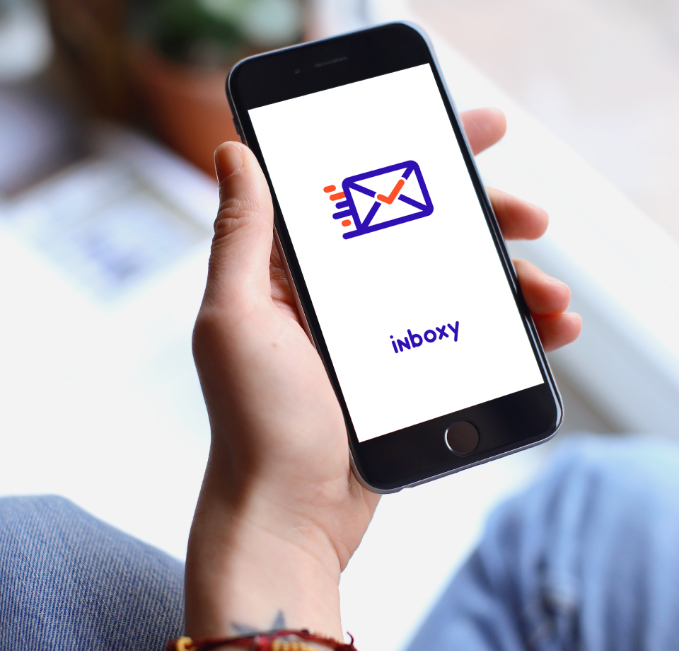
As the creator of the brand identity for Inboxy, I’m excited to showcase how its visual and verbal essence captures its innovative spirit as an AI-driven auto email software. In a world drowning in digital communication, Inboxy stands out by offering intelligent solutions that streamline inboxes and empower users to focus on what truly matters.


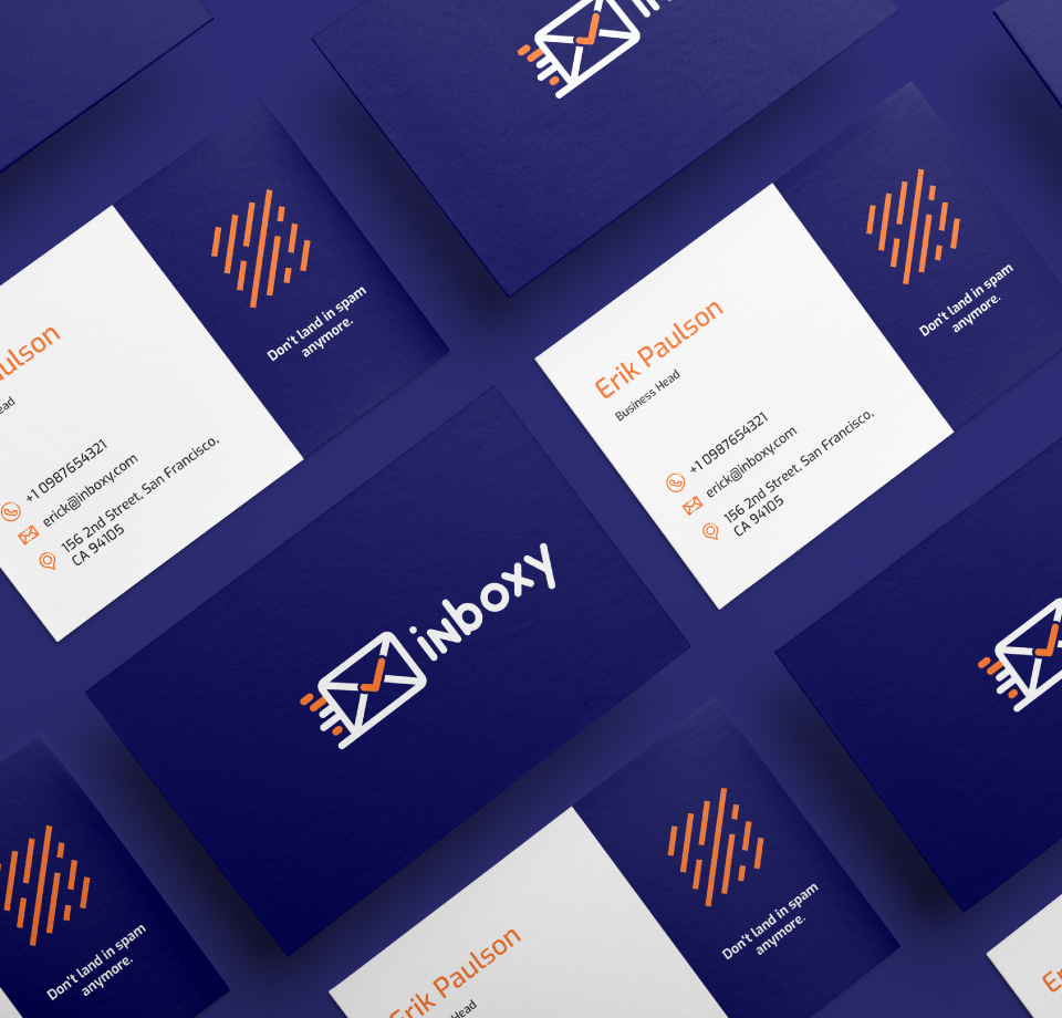
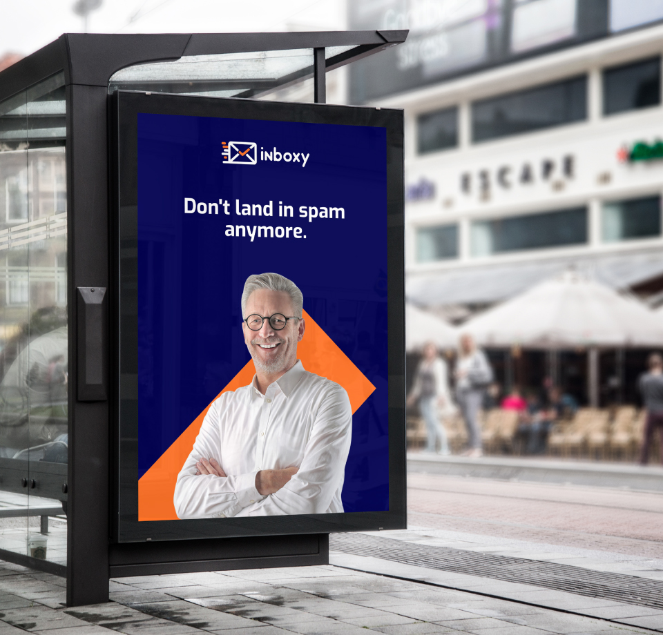
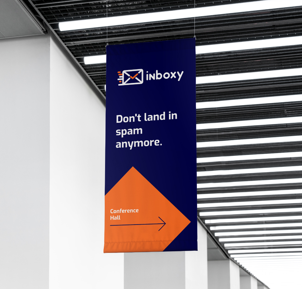
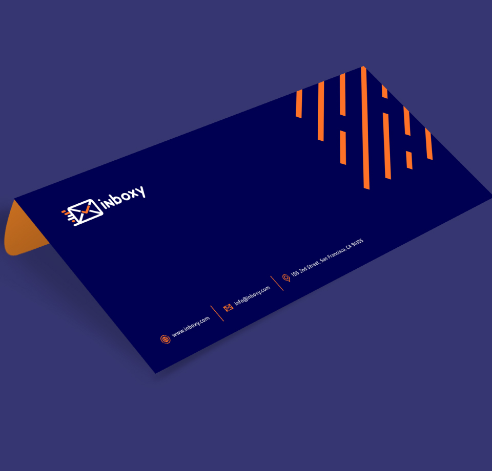
For an AI-driven software like Inboxy, a strong brand identity is crucial. It builds trust with users by making complex technology seem approachable, communicates the software’s unique value proposition (AI-driven automation), and differentiates it in a crowded market. This brand identity ensures that every interaction with Inboxy, from its interface to its marketing, reinforces its promise of intelligent email management.
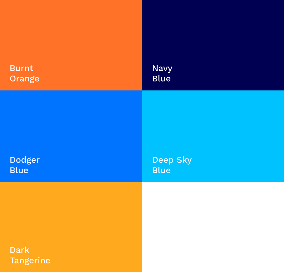
When creating a communication piece the overall color impression should be Orange & Navy Blue with highlights of colors from secondary palette.
To Achieve a world-class look, allow your high-quality imagery to provide the color on materials. If are typographic only(no images) we recommend an increase in the use of color to compensate
